
In the world of branding, flexibility is key. A successful logo should not only be aesthetically appealing but also adaptable across various platforms and use cases. Whether you’re rebranding, expanding into new markets, or creating new promotional materials, it’s essential to know how to tweak your logo without losing its essence. In this article, we’ll guide you through the process of adapting your logo for different branding needs.
This article was prepared by Turbologo experts.
Why logo adaptability is important for your brand
A logo is more than just an image—it’s a visual representation of your brand’s identity. In today’s multi-channel world, your logo needs to look great across a variety of platforms, from websites and social media profiles to print materials and merchandise. A logo that can adapt to different environments is essential for maintaining brand consistency and recognition.
This adaptability ensures your logo can grow with your brand as it evolves, whether you’re launching new products, entering new markets, or adjusting to changes in your target audience. Exploring different logo ideas can help you create a design that remains flexible and relevant throughout your brand’s journey.
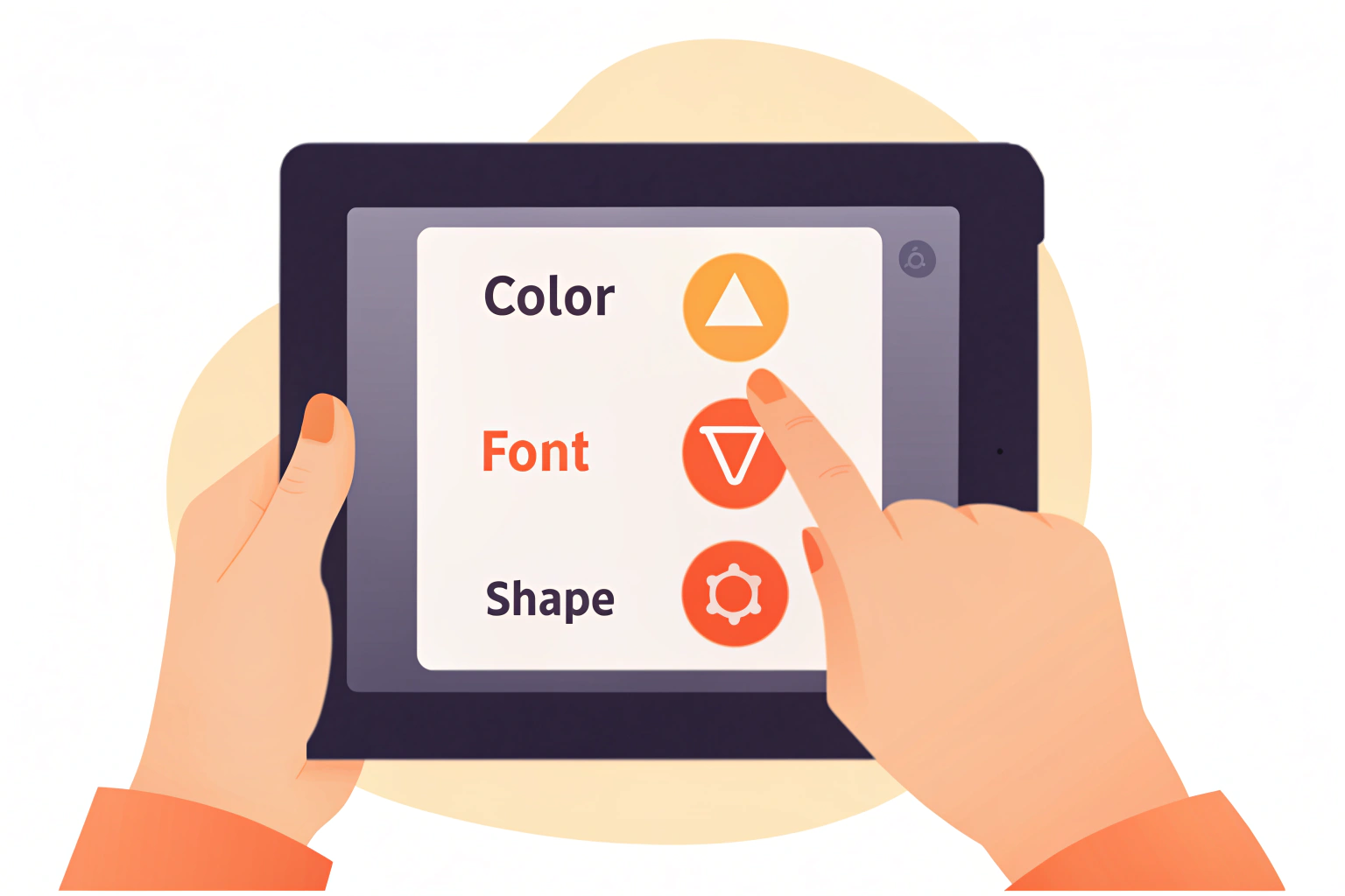
Key considerations when adapting your logo
Adapting your logo involves understanding where and how it will be used. Each platform or application may require adjustments to ensure your logo remains impactful. Here are key factors to consider when adapting your logo:
- Size and scalability: Your logo needs to be legible and recognizable at different sizes, from a small social media avatar to a large billboard. It should remain clear and sharp, no matter the dimensions.
- Color variation: Depending on the medium, you may need to adapt the color palette. For instance, a logo on a dark background may require lighter colors for visibility, while a logo on a transparent background may need adjustments to the color contrast.
- Context and format: Consider how the logo will be displayed. Will it be in digital, print, or both formats? Each context may require different approaches, whether it’s a responsive website or printed promotional materials.
By focusing on these factors, you can make sure your logo works in any setting while maintaining consistency and clarity.
Adapting your logo for digital platforms
Your logo should look equally impactful across digital platforms, including websites, social media, apps, and digital advertisements. Each platform has unique requirements for displaying logos, and understanding these nuances can help you create the best possible user experience.
Things to consider for digital adaptation:
- Social media profiles: Logos for social media profiles must be scalable and clear in small formats. Use simple, bold designs that stand out in profile pictures, as they’re often viewed at a reduced size.
- Responsive websites: A responsive logo adjusts for different screen sizes. This means that logos should scale well on desktop, tablet, and mobile devices without losing clarity.
- App icons and favicons: These icons are often small, so it’s crucial to ensure your logo looks great when reduced to a tiny size. Sometimes, simplifying the logo or using a monogram or icon version works best.
Adapting your logo for digital platforms ensures it’s effective, whether it’s on a mobile phone or a large desktop screen.
Adapting your logo for print materials
Print materials still play a major role in marketing, from business cards and brochures to large-scale billboards. The key challenge here is making sure your logo maintains quality across different printing processes and sizes.
Considerations for print adaptation:
- Resolution: Make sure your logo is in a high enough resolution to avoid pixelation when printed on physical materials. Use vector formats like SVG or EPS to maintain quality at any size.
- Color adjustments: Colors in print can look different than on screens due to varying color models (RGB for digital, CMYK for print). Ensure your logo’s color palette translates well in print to avoid color distortion.
- Material types: The surface on which your logo is printed (e.g., paper, fabric, signage) can affect how it appears. Consider how your logo will look on different materials and adjust it accordingly.
When adapting your logo for print, ensure that it remains clear, vibrant, and aligned with your brand’s visual identity.
Adapting your logo for merchandise and promotional items
Logos are frequently used on promotional materials, such as t-shirts, bags, mugs, and other merchandise. When adapting your logo for these types of products, it’s important to consider both the design and the material.
Things to keep in mind for promotional items:
- Size and placement: On promotional items, your logo needs to be placed where it’s visible and proportionate to the product. For example, on a t-shirt, the logo might be placed on the front, while on a mug, it could be placed on the side.
- Material considerations: Different merchandise materials (like fabric, plastic, or metal) can affect how the logo is applied. Ensure that the design works with the texture of the product.
- Printing techniques: The method used to apply your logo (e.g., screen printing, embroidery, or laser engraving) can affect its appearance. Adapt your logo’s design accordingly for the best results with each technique.
Adapting your logo for merchandise ensures that it looks professional and effective, no matter the product.
Streamlining logo versions for different needs
To make logo adaptation easier, it’s important to create different versions of your logo for specific use cases. This allows you to maintain consistency while ensuring your logo works well in each context.
Versions of your logo to consider:
- Full logo: This version includes both the icon and the brand name and is ideal for large formats like billboards or websites.
- Icon-only logo: For smaller formats like social media profiles or mobile app icons, an icon-only version can help maintain clarity and recognition.
- Horizontal and vertical versions: Different orientations of your logo allow flexibility depending on the space available. A horizontal version might work better for banners, while a vertical version can be ideal for social media.
- Black-and-white version: A simplified version of your logo in black and white ensures it looks great when color isn’t an option or when it’s printed in monochrome.
Having multiple versions of your logo allows for greater flexibility in adapting it to different branding needs.
Frequently asked questions about logo adaptation
Q: Can I change my logo every time I adapt it?
A: No, consistency is key. While it’s fine to make adjustments, your logo should remain consistent in its core design to maintain brand recognition.
Q: How do I ensure my logo works well on social media?
A: Keep it simple and scalable. Use bold, clear elements that stand out even in small sizes, and ensure that your logo maintains its integrity when viewed as a profile picture.
Q: What file formats should I use for logo adaptation?
A: Always use vector formats like SVG or EPS for scalability, as they can be resized without losing quality. For print, CMYK color modes should be used, while RGB is preferred for digital.
Q: Can I adapt my logo for a new product line?
A: Yes, it’s common to tweak your logo to fit new products or services. You can create a sub-brand logo that aligns with your main logo but introduces new elements to reflect the new offerings.
Q: Should I hire a professional to adapt my logo?
A: If you’re unsure about making the right changes, it’s a good idea to work with a designer. They can ensure that your logo is adapted effectively while maintaining its brand integrity.
Adapting your logo for different branding needs ensures that your brand maintains a cohesive and strong presence across all platforms. By considering the context of each platform and making necessary adjustments, your logo will continue to serve your brand effectively, no matter where it appears.

